Deep learning brain segmentation
Overview: Built an end to end workflow that segments brain regions from microscopy style images, converting a time intensive manual labeling process into a repeatable pipeline. The project focuses on producing consistent masks that support downstream measurement and analysis, while staying simple to run and easy to review for quality.
Tools used: Python, PyTorch, OpenCV.
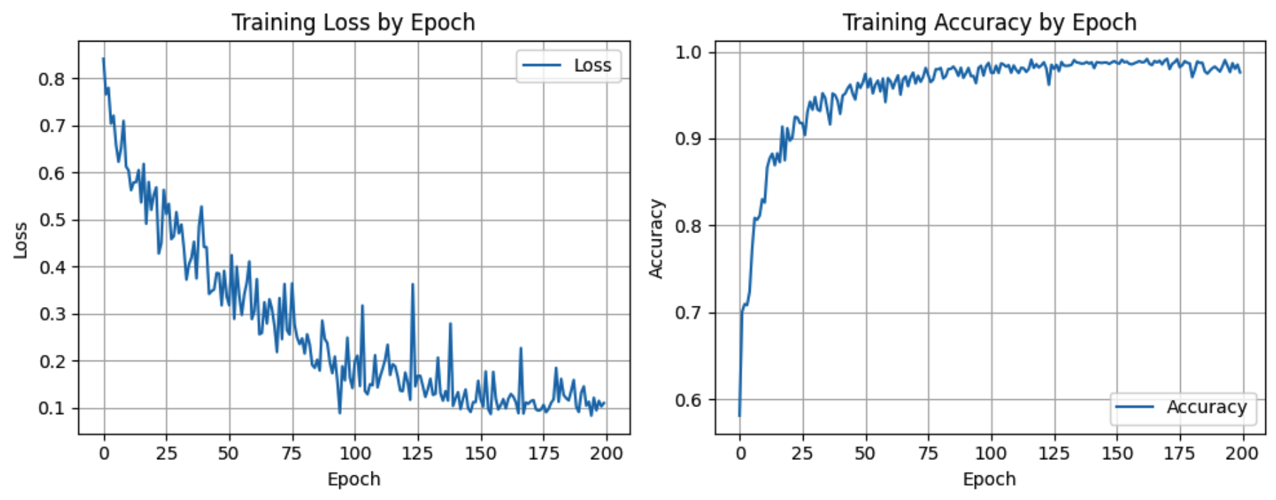
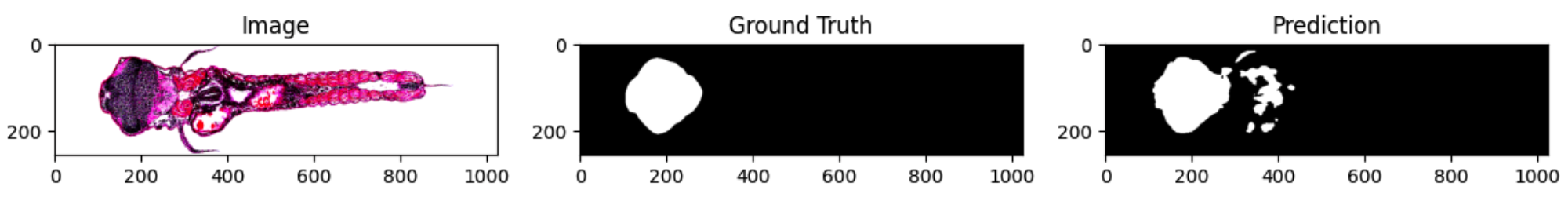
Approach: Prepared paired images and ground truth masks, then implemented preprocessing that standardizes sizing and intensity while filtering out low quality samples. Built training data loaders with safety checks so the model always receives correctly aligned inputs. Trained a U Net architecture and tracked loss and accuracy across epochs, then validated results by comparing predicted masks against ground truth both visually and with metrics. Iterated on preprocessing, learning rate, and regularization settings to reduce overfitting and improve generalization to new samples.
Impact: Produces segmentation outputs that are consistent across runs and faster to generate at scale than manual labeling alone. The pipeline reduces human variability, improves repeatability for analysis, and adds a clear review loop so collaborators can confirm quality before using the outputs in research conclusions or further experiments.